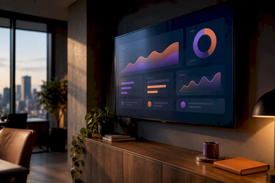
Published on
8 AI Dashboard Examples You Can Clone and Wire to Real Data
This page gives you eight copy-ready AI dashboard examples and the exact design rules to adapt them for your team. If you run operations, start with the anomaly-detection factory dashboard in example one. Finance leads should jump to the cash-forecasting template, and analytics teams will get the most from the model-drift monitor. Every example below pairs a real job with the AI feature that actually earns its place on screen, and BRDGIT builds this kind of system for a living when a template needs to become production software.
TL;DR:
A well-designed AI dashboard should prioritize decision-driving metrics and clear AI features like predictions and recommendations, not just data visualization.
Connecting dashboards to real data sources requires careful planning, including defining consistent field names and testing with realistic synthetic data before live deployment.
The most effective dashboards place key metrics where users’ eyes land first and use appropriate chart types, color palettes, and accessibility considerations to support rapid decisions.
Transitioning from templates to operational tools demands clear labels, simplified widget sets, and building a decision map to guide user actions and avoid feature bloat.
Success depends on integrating dashboards with existing systems, maintaining data accuracy amid drift, and training teams to trust and act on model-driven insights.
BRDGITTurn Dashboard Ideas Into Working SystemsBRDGIT helps teams identify the right AI opportunities, build clear roadmaps, and create custom AI systems for real business needs.Explore BRDGIT
Table of Contents
8 AI Dashboard Examples and Templates Worth Cloning
What Actually Makes an AI Dashboard Different From a Regular One
Design Rules That Hold Up Once Real Data Hits the Screen
How the Templates Map to Different Industries and Jobs
What Data You Actually Need to Wire These Live
From Template to Production: What BRDGIT Sees Most Often
Our Take: The Gallery Is the Easy Part
Turning These Templates Into a Working System
A Few More Places to Look
Sources
FAQ
8 AI Dashboard Examples and Templates Worth Cloning
Each of these AI dashboard examples names the job it solves, the two or three widgets that carry the weight, and the AI feature that turns a static chart into something a person can act on. Treat this as a starting shortlist, not a catalog. Pick one, wire it to sample data, and see if the decision it supports actually gets made faster.
Executive performance summary. Revenue trend, margin by segment, and a narrative insight card that explains the biggest month-over-month swing in plain language. AI feature: generated commentary pulled from finance and CRM exports. Best for a Monday-morning leadership review.
Manufacturing kpi dashboard. Throughput, scrap rate, and machine-health status feed a predictive maintenance widget that flags which line is likely to fail this week. AI feature: anomaly detection on sensor telemetry. This is the strongest MVP candidate for a factory floor because the payoff (fewer surprise outages) shows up fast.
Cash-forecasting dashboard. A 13-week cash curve, a scenario toggle (best/base/worst), and an action card recommending which receivables to chase first. AI feature: forecast modeling with confidence bands. Data sources: ERP ledger, accounts receivable, bank feed.
CRM pipeline health dashboard. Lead score distribution, pipeline leakage by stage, and a next-best-action card per deal. AI feature: predictive lead scoring. Pulls from CRM activity logs and email engagement data.
Support operations dashboard. SLA risk scorecard, ticket volume by category, and an AI-suggested reply preview for agents. AI feature: prescriptive triage. Data sources: helpdesk API, chat transcripts.
ML ops model-monitoring dashboard. Latency, failed-run rate, and a drift heatmap across model versions. AI feature: automated drift detection with retrain triggers. Best suited for teams already running more than one model in production.
Scheduling and booking dashboard. Utilization by resource, no-show risk score, and a suggested rebooking slot. AI feature: predictive no-show scoring. Common in hospitality, staffing, and services businesses.
Operations kpi dashboard for distribution. On-time delivery rate, inventory turns, and an exception queue ranked by AI-estimated business impact. AI feature: anomaly detection paired with impact scoring. Data sources: warehouse management system, carrier APIs.
Template providers like UIBakery’s AI Dashboard template package similar model-monitoring widgets, version comparisons, and usage alerts if you want a starting layout rather than building widget-by-widget.
What Actually Makes an AI Dashboard Different From a Regular One
A traditional dashboard tells you what happened. An AI-powered dashboard tells you why it happened and what to do about it. That distinction shows up in four capabilities worth building toward:
Predictive cards that estimate what a metric will do next, not just where it has been.
Prescriptive cards that recommend a specific action, ranked by expected impact.
Narrative insight that explains a spike or dip in a sentence instead of forcing the user to guess.
Anomaly detection that surfaces the one row out of ten thousand that actually needs a human.
A well-built card does not just say “conversion dropped 12%.” It says “conversion dropped 12% in the checkout flow, likely tied to the payment gateway timeout that started Tuesday, and here are the three accounts affected.” That is the gap between a chart and a decision.
Model-backed insights carry risk if you skip a few safeguards: show a confidence level next to any prediction, note where the underlying data came from, and keep a human-in-the-loop step for anything above a defined dollar or safety threshold.
Pro Tip: Never let a model-generated recommendation execute automatically on its first deployment. Route it to a person for two to four weeks, log how often they override it, and only automate once the override rate is low.
Design Rules That Hold Up Once Real Data Hits the Screen
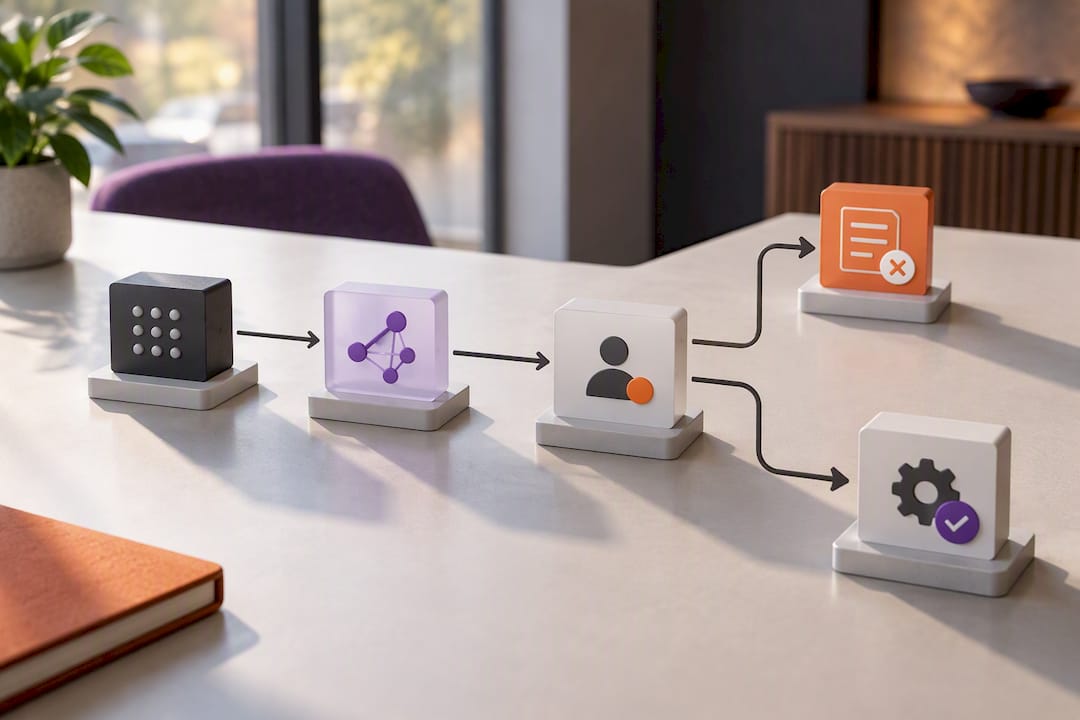
The single biggest layout mistake teams make is putting a vanity metric, total signups, page views, in the top-left corner where the eye lands first. Design guides on dashboard UI best practices recommend reserving that position for the metric that actually drives a decision this week, with a KPI strip of three to six cards and one dominant chart below it.
A layout pattern that survives contact with production data looks like this:
KPI strip across the top (three to six cards, decision metrics only).
One dominant chart directly below, sized to draw the eye first.
Two or three supporting charts beside or beneath it.
A detail table at the bottom for drill-down, not for the first glance.
A 12-column grid, which gives you enough flexibility to resize widgets without breaking alignment on smaller screens.
Chart choice matters more than most builders assume. A bar or bullet chart communicates a comparison against a target far more precisely than a pie chart, which is why most enterprise dashboard style guides restrict pie charts to two or three segments at most. Color accessibility is a five-minute fix with a lasting payoff: pull from ColorBrewer’s tested palettes and check contrast so the dashboard still reads correctly for users with common forms of color vision deficiency, a point Colour Blind Awareness covers in more depth.
Roughly 1 in 12 men has some form of color vision deficiency, which is why red/green status indicators without a secondary shape or label cue fail a meaningful share of any user base.
Governance rounds this out. Every metric on the dashboard needs one standardized definition, written down, so “active user” means the same thing in the executive view and the analytics view. Build a fallback behavior for missing data too. A blank chart looks broken; a chart that says “no data for this period” looks intentional.
How the Templates Map to Different Industries and Jobs
The same widget can look almost identical across two industries and still solve a completely different problem depending on what triggers action.
Operations and manufacturing. A factory kpi dashboard pairs throughput and downtime with a predictive maintenance widget, then routes alerts to the shift supervisor who can actually act on them, not to a general inbox nobody checks.
Finance. Cash forecasting works best with a scenario toggle so a CFO can flip between best, base, and worst case without opening a new model each time, paired with a ranked action recommendation on which invoices to chase.
Sales and CRM. Lead scoring and pipeline leakage detection matter less than the next-best-action card that tells a rep exactly which deal to touch today.
Support. An SLA risk scorecard combined with an AI-suggested reply preview cuts response time without removing the agent’s judgment on tone.
Product and ML teams. Model drift dashboards need a retrain trigger built in, not just a chart, so degradation gets flagged before it shows up in a customer complaint.
What Data You Actually Need to Wire These Live
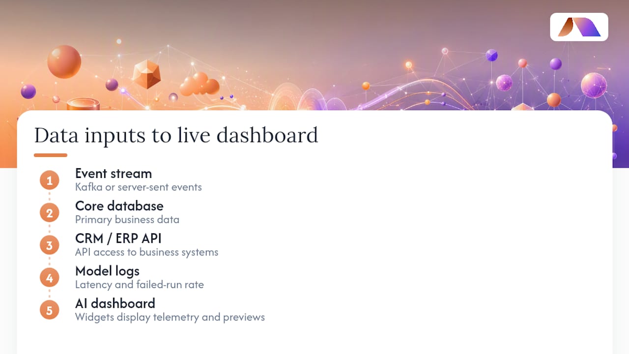
An AI dashboard is only as good as the pipes feeding it, and most teams underestimate how much plumbing sits behind a clean-looking widget. You will typically need an event stream (Kafka or server-sent events for anything real-time), a connection to your core database, model logs capturing latency and failed-run rate, and API access into whatever CRM or ERP holds the business data.
Streaming versus batch is a real tradeoff, not a default choice. An AI-ops dashboard monitoring live agents needs a one- to two-second refresh, based on patterns in open-source agent-monitoring dashboards that use progress bars and health heatmaps for that purpose. A weekly executive summary does not need to refresh faster than once a day.
Before wiring anything to production, build with realistic synthetic preview data, including edge cases like empty states and extreme outliers, because most dashboard mockups fail once real data arrives. Open-source projects like AI-Native-Dashboard show this pattern directly: a prompt generates a widget, streaming preview data validates the layout, and only then does it connect to live telemetry.
Pro Tip: Define your canonical field names before a single widget gets built. Renaming “customer_id” to “cust_id” halfway through a build is how integration timelines quietly double.
From Template to Production: What BRDGIT Sees Most Often
Moving from a template to a working dashboard follows a consistent path: a readiness assessment, a decision map naming who acts on what, an MVP dashboard built on real (not synthetic) data, then iteration. The most common failure BRDGIT sees is the shiny-feature chase, teams adding a forecast widget nobody asked for while the metric definitions underneath stay unlabeled and inconsistent. The fix is almost always smaller than the problem: fewer widgets, clearer labels, and an action attached to every card.
Our Take: The Gallery Is the Easy Part
Most AI dashboard content stops at the gallery. It shows you pretty widgets and calls it done. The harder, more valuable work is the decision map behind each screen: who looks at this, what do they do next, and what happens if the model is wrong. Skip that step and you get a dashboard that looks sophisticated and changes nothing.
The conventional advice, “add more AI features”, is usually backwards. A dashboard with three well-labeled, confidence-scored predictions beats one with ten flashy but unexplained ones every time we have seen it tested against real usage. What most teams should prioritize first is not the model, it is the metric definition underneath it. Get that wrong and every AI feature built on top inherits the mistake.
If there is one habit worth stealing from the examples above, it is the decision-driving metric placement discussed in the design section. Put the number that changes behavior where the eye lands first, every time, no exceptions for whatever metric looks most impressive in a demo.
— Team BRDGIT
Turning These Templates Into a Working System
Cloning a template is the easy five percent. Wiring it to your actual ERP, CRM, or shop-floor sensors, keeping it accurate as data drifts, and training your team to trust and act on it is the other ninety-five. BRDGIT’s stated approach favors fast-start, modular builds over bloated platforms, which matters most right here, at the point where a Figma mockup has to become a real, load-bearing tool.
If you are not sure which example fits your data or your team’s actual workflow, an AI Readiness Assessment is the lowest-effort way to find out before committing budget to a build. For teams that already know what they want but lack the hands to build it, Dashboard Builder and Fractional Engineer Services provide the engineering support to take one of these templates from prototype to something your operations team actually opens every morning. Book a readiness assessment and bring one dashboard idea. That is enough to start the conversation.
A Few More Places to Look
For deeper reading beyond this gallery: ColorBrewer and Colour Blind Awareness for palette accessibility, AI-Native-Dashboard and ai-agents-dashboard for working code, and analytics-driven content dashboards for a marketing-side view of decision metrics.
Sources
FAQ
How Do I Make a Dashboard With AI?
Start by naming the decision the dashboard needs to support, then pick two or three widgets that feed that decision directly. Tools like AI-Native-Dashboard show how a natural-language prompt can generate an editable widget with streaming preview data before you connect anything to production systems.
What Are Some Good Examples of Dashboards?
Strong examples include a manufacturing kpi dashboard with predictive maintenance alerts, a cash-forecasting dashboard with scenario toggles, and an ML model-monitoring dashboard tracking drift and failed-run rate. Each of the eight templates above is built around one specific job rather than trying to cover every metric at once.
Can ChatGPT Create a Dashboard?
ChatGPT and similar tools can generate dashboard layouts, sample chart code, and even natural-language-to-widget prototypes, but they cannot wire themselves to your live ERP, CRM, or sensor data. That connection work, plus governance around metric definitions, is usually where a fractional engineer or a service like BRDGIT’s Custom Agent Build comes in.
Which AI Tool Is Best for Making Dashboards?
There is no single best tool. It depends on whether you need rapid prototyping (natural-language generation tools), enterprise-grade model monitoring (template platforms like UIBakery), or a fully custom system wired to your own data, which is closer to the Dashboard Builder service BRDGIT offers.
What Does BRDGIT Charge for a Dashboard Build?
Pricing for a Dashboard Builder engagement is not published, since scope varies by data complexity and integration needs. Current pricing details are available directly on the BRDGIT site.